
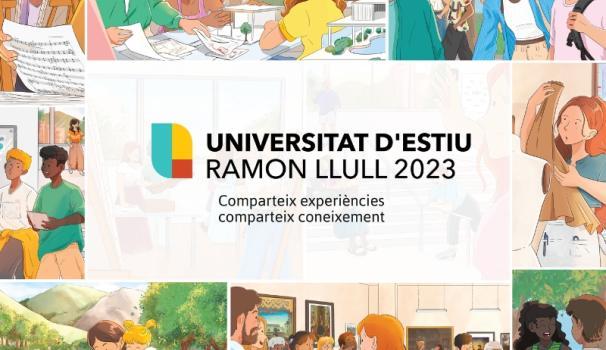
June 2, 2023
Blanquerna-URL renews its corporate visual identity
January 27, 2023
Coinciding with the celebration of Saint Thomas Aquinas, the updated version of the different elements that make up Blanquerna-URL's visual identity was presented today, featuring a clear, vibrant, digital style.
The new version of the current Gothic "b" (dating from 1948) was shown, keeping the characteristic font, but in a lighter color, with a more modern, cleaner and more readable design.
The changes that Blanquerna has undergone and is still undergoing, and the way it has adapted to different periods in its history, need to be reflected in a visual identity that represents the institution and is in tune with its mission, vision and values. A change has thus been made to its corporate visual identity, responding to current needs while remaining faithful to the institution’s origins.
The redefinition project began last year, when Avantt, the new corporate typeface, was used for the word "Blanquerna", making it easier to read and giving it a more modern feel. The main color was also updated to make it brighter, more digital and more optimistic. Finally, this year the institution's logo was also modernized, with changes to the master brand and its application to Blanquerna's different educational areas and services.
In the coming months you will see new versions of Blanquerna-URL visual elements that reflect this new style: on the website, in publications, in advertisements and on buildings. We are still Blanquerna, but with a modern, more cohesive image that is recognizable wherever it is used.
Related news
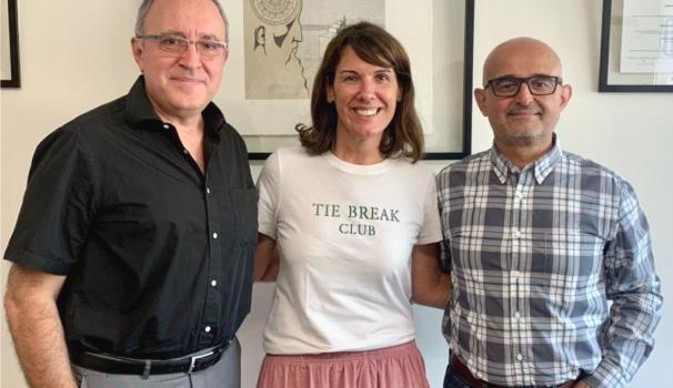
Meet speech therapist Laura López, technical director of the applied psychology centre Kinderapia

April 18, 2023
Meet speech therapist Laura López, technical director of the applied psychology centre Kinderapia
BarcelonActua and Blanquerna-URL explore new avenues of collaboration
September 27, 2022
BarcelonActua and Blanquerna-URL explore new avenues of collaboration
The Blanquerna Bachelor degree in Psychology enters the prestigious Global Ranking of Academic Subjects of the Shanghai Ranking
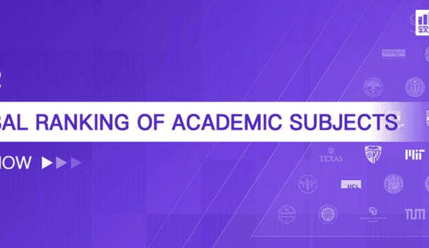
August 4, 2022
The Blanquerna Bachelor degree in Psychology enters the prestigious Global Ranking of Academic Subjects of the Shanghai Ranking
- Share:

